插件中文资料库
中文说明、玩家点评、适用场景和替代推荐,方便快速判断是否适合你。
- 界面布局、头像框、姓名板和动作条优化
 Copy Anything
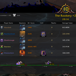 Details! Mythic+ Scoreboard
 Myslot
SparkPoint 插件下载与使用指南
本页整理了 SparkPoint 的功能用途、适用人群、安装方法和常见问题,方便玩家快速判断是否需要安装。
适合谁用
SparkPoint 是一款 动作条 / 战斗 / 界面美化 / 单位框架 类插件,适合需要优化界面、提升操作效率或补充游戏信息提示的魔兽世界玩家。
基本信息
- 插件作者:hippopotype
- 插件分类:动作条 / 战斗 / 界面美化 / 单位框架
- 适配版本:12.0.0,12.0.1,12.0.5,12.0.7
- 累计下载:8,229
安装方法
- 点击上方下载按钮获取 SparkPoint插件文件。
- 解压后将插件文件夹放入 World of Warcraft/_retail_/Interface/AddOns 目录。
- 重启游戏或在角色界面点击插件,确认 SparkPoint 已启用。
- 如果插件不生效,请检查版本是否匹配,或关闭同类冲突插件后重试。
使用建议
SparkPoint 安装后建议先在角色界面确认已启用,进入游戏后根据插件提供的命令、小地图按钮或设置面板进行调整。如遇到报错,可先单独启用该插件排查冲突。
SparkPoint 常见问题
SparkPoint 适合需要 动作条 / 战斗 / 界面美化 / 单位框架 类功能的玩家,特别是希望提升游戏便利性、界面管理或战斗信息获取效率的用户。
下载后解压到 Interface/AddOns 目录,然后重启游戏并在角色界面启用插件。
常见原因是目录多套一层、游戏版本不匹配、依赖插件缺失或同类插件冲突。
可以查看本页的替代插件推荐和相关插件区域,按下载量和分类选择同类工具。
插件 AI 问答
可以问:这个插件正式服能用吗、和 DBM 冲突吗、怎么设置、有没有替代插件。
SparkPoint 是一款魔兽世界插件,主要用于界面框架、头像、动作条或冷却显示优化。建议根据自己的版本和插件环境先测试兼容性。
插件用途
SparkPoint 主要面向需要单位框架功能的玩家,用来改善游戏体验、减少重复操作或补充默认界面没有直接提供的信息。
适用场景
- 界面框架、头像、动作条或冷却显示优化
使用建议
安装后建议先在角色选择界面或插件管理器中确认已启用,再进入游戏测试是否与现有整合包、WA 和其他插件冲突。如遇报错,可以先禁用同类插件排查。
SparkPoint
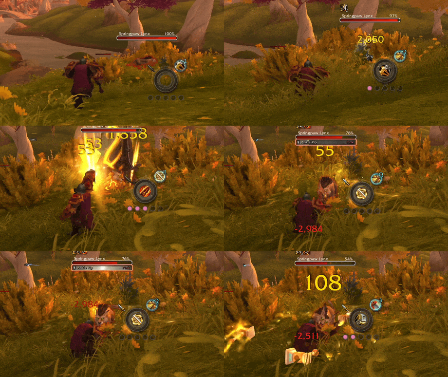
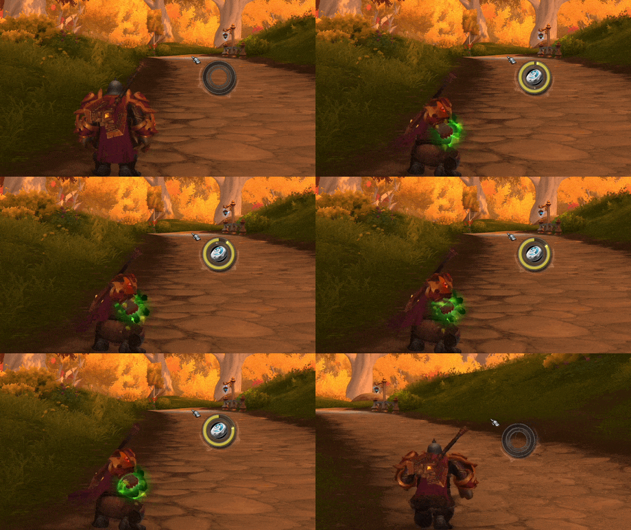
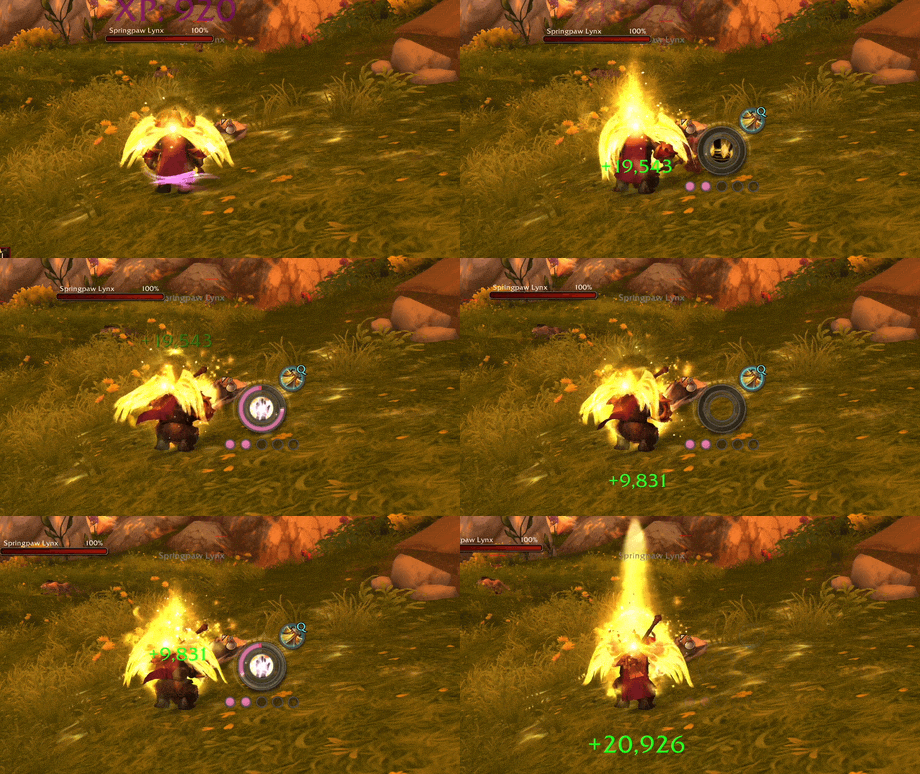
Cast rings, cooldown arcs, class resources, and assisted-combat cues around your cursor.
 |
 |
 |
 |
 |
 |
If SparkPoint has been useful for your runs, I’d really appreciate a small favor: leave a kind word about it on CurseForge, Discord, Reddit, or wherever your WoW friends hang out. A quick rating, short comment, or screenshot helps far more than you might think, and it genuinely helps the addon reach more players. Thanks for helping SparkPoint grow, and happy Midnight to you all!
Overview
SparkPoint is a lightweight, event-driven WoW addon that keeps important combat feedback near your cursor instead of pushing your eyes back to unit frames or action bars.
It currently includes:
- Cast ring with latency overlay, interrupt feedback, spell text, and click-feedback ring
- Up to 3 assignable ring slots
- Top and bottom bar slots with health, mana, and class power providers
- Class resource display with dedicated per-class systems
- Decorative rotating ring
- Spell icon with cast swipe, instant-cast feedback, and cooldown-blocked feedback
- Assisted Highlight support for Blizzard's suggested-spell system
- Optional performance stats HUD
- Shared visibility rules, per-module overrides, and optional HUD transitions
- Cursor-attached mode, fixed anchor mode, minimap button, and profile support
New In v1.4.4
- Updated addon metadata for WoW 12.0.7
Previously In v1.4.x
- Added empowered cast support
- Added a cast spell text anchor setting
- Added an optional performance stats HUD module
- Hid the bottom bar slot while empowered cast markers are visible to reduce overlap
- Hardened hover visibility frame inspection
- Defaulted class resources to the classic renderer mode
- Rebuilt class resources as a pluggable system with dedicated renderers for each class
- Added dedicated resource systems for Death Knight Runes, Evoker Essences, Rogue and Druid Combo Points, Paladin Holy Power, Monk Chi, Arcane Charges, Soul Shards, and Maelstrom Weapon
- Added native animation groups for spend, fill, recharge, and cooldown transitions in dedicated systems
- Added a Class Power bar provider with dynamic class power or mana source resolution in bar slots
- Added addon-wide resource color overrides for health, mana, class power, and class resource systems
- Added visual style and fill color source settings for class resources
- Added simple pip animation support for generic class resource pips
- Added a new bottom bar slot with dedicated fill texture and matching layout, text, and visibility controls
- Refactored ring slot settings around named outer, middle, and inner slots with per-slot enable, provider, appearance, and shared visibility controls
- Added a framed shell for the cast spell icon for cleaner HUD presentation
- Improved cooldown and charge handling APIs used by GCD tracking and readable cooldown-blocked feedback
- Added a
Noneprovider option for bar slots and updated defaults - Added a new top bar slot module with dedicated health and mana providers
- Added full top bar slot styling controls for fill, background, frame, and provider-based coloring
- Added top bar slot text with configurable mode, number style, font, outline, opacity, and offsets
- Added slot-specific visibility settings and hide overrides for the top bar slot
- Added centralized HUD layer roots with live frame strata updates for cleaner layering across modules
- Added hide rules for pet battles and Blizzard special action bar contexts
- Improved top bar texture fidelity, baseline alignment, and fade behavior
Previously In v1.3.x
- Added target alive/dead visibility filters
- Split instant-cast visibility into direct and triggered variants
- Improved Visibility setting tooltips for clearer explanations
- Added cast progress display modes for all casts, normal casts only, or channelled spells only
- Split cast fill color controls into explicit source modes with single-color, normal/channelled, and class-color behavior
- Added separate class-color toggles for the cast spark and cast spell text
- Expanded visibility rules with hostile/unfriendly, neutral, and friendly target filters
- Added interrupt-flash feedback for interrupted channelled casts
- Added richer Spell Icon feedback for direct instant casts, triggered instant casts, failed casts, and readable cooldown-blocked presses
- Added a dedicated readable cooldown swipe color with optional class-color override
- Standardized slash commands to the
/sparkpointfamily only - Added HUD transition effects with configurable fade timing, easing, and show/hide hysteresis
- Added visibility control to hide SparkPoint while hovering clickable UI for cleaner world targeting
- Added customizable background tint colors for the cast ring and inner slot rings
- Added configurable class resource pip background color
- Added RGBA color control for the spell icon cast progress swipe
- Reorganized settings labels for clarity
Features
Cast Ring
The main cast ring renders around your cursor and supports:
- Cast progress with spark
- Reverse fill for channeled spells
- Latency arc
- Interrupt/failure flash
- Optional spell name text with configurable font, size, outline, color, and offsets
- Configurable fill color modes, including class color and separate channelled-cast color
- Configurable bar, spark, glow, frame, and background tint/opacity
- Click-feedback ring for left and right mouse buttons
Ring Slots
SparkPoint supports up to 3 concentric inner slots inside the cast ring.
- Each slot can be assigned independently
- Current provider: GCD
- Each slot has configurable bar color, background tint, opacity, and optional class-color override
Bar Slots
SparkPoint supports dedicated top and bottom bar slots positioned above and below the main cast ring.
- Current providers: Health, Mana, and Class Power
- Configurable fill color source, background tint, frame tint, and independent opacity controls
- Optional text overlay with current, max, and percent display modes
- Configurable text font, outline, number style, opacity, and offsets
- Independent top/bottom layout controls plus slot-specific visibility overrides and hide rules
Class Resource
Displays class-specific resources near your cursor with dedicated per-class rendering systems.
Dedicated systems: Death Knight Runes, Evoker Essences, Rogue Combo Points, Druid Combo Points, Paladin Holy Power, Monk Chi, Arcane Charges, Soul Shards, and Maelstrom Weapon
Generic pips: fallback for simple discrete resources
Configurable options include:
- Scale and opacity
- Separate offsets for the resource display
- Visual style and fill color source settings
- Fill color, background tint, and class-color override
- Simple pip animation support
- Per-module visibility override
Decorative Ring
A stylized ring rendered around the cursor with:
- Multiple texture variants
- Optional rotation
- Configurable size and color
- Optional class-color tint with opacity control
- Per-module visibility override
Spell Icon
Displays the icon of the currently cast spell below the ring.
- Optional cast-progress swipe
- Configurable swipe RGBA color
- Optional instant-cast icon display for direct casts
- Optional triggered instant-cast icon display for procs and follow-up effects
- Configurable failed-cast response
- Optional readable cooldown-blocked feedback with remaining-cooldown swipe
- Separate readable cooldown swipe color with optional class-color override
- Configurable size and offsets
Assisted Highlight
Displays Blizzard Assisted Highlight's suggested spell near the SparkPoint HUD.
- Independent from the spell icon
- Icon opacity, glow, glow color, and positioning controls
- Optional breathing glow transition with speed and strength controls
- Optional keybind text with compact/full format, font, outline, size, opacity, color, and offsets
- Hidden automatically if Blizzard Assisted Highlight is disabled
- Per-module visibility override
Visibility And Transitions
SparkPoint supports both addon-wide visibility rules and per-module overrides.
Available rules include:
- Always
- In Combat
- Out of Combat
- Has Target
- Has Alive Target
- Has Dead Target
- Has Hostile / Unfriendly Target
- Has Neutral Target
- Has Friendly Target
- While Casting
- After Instant Cast
- After Triggered Instant Cast
- In Party
- In Raid
- In Instanced Content
Additional behavior:
- Optional hide while hovering clickable UI
- Optional hide in pet battles
- Optional hide in Blizzard vehicle, override, possess, and similar special action bar contexts
- Optional transition system with fade in/out durations, easing, and hysteresis
Quality Of Life
- Attach to cursor or use a fixed anchor
- Minimap button with optional fade behavior
- Global or class-specific profiles
- Standardized
/sparkpointslash commands for settings and anchor control
Configuration
Slash Commands
| Command | Action |
|---|---|
/sparkpoint |
Open settings |
/sparkpoint unlock |
Unlock the anchor for manual drag placement |
/sparkpoint lock |
Lock the anchor |
/sparkpoint reset |
Reset to default cursor-attached positioning |
You can also open settings from the minimap button.
Settings Layout
Open the Blizzard Settings panel via /sparkpoint. SparkPoint provides sections for:
- General
- Visibility
- Transition
- Modules
- Cast Ring
- Ring Slots
- Bar Slots
- Class Resource
- Decorative Ring
- Spell Icon
- Assisted Highlight
- Profiles
Compatibility
- Supported interface versions:
12.0.0and12.0.1 - No external libraries required
- Event-driven design with no heavy persistent update loops
License
CurseForge: https://www.curseforge.com/wow/addons/sparkpoint用户评价
暂无 / 5,0 条评价相关推荐
继续看看这些内容