插件中文资料库
中文说明、玩家点评、适用场景和替代推荐,方便快速判断是否适合你。
- 日常任务、练级和满级玩法辅助
- 界面体验优化和信息展示增强
- 副本前先测试兼容性,确认不报错后再长期使用
 Copy Anything
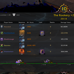 Details! Mythic+ Scoreboard
 Myslot
Krowi's Progress Bar 插件下载与使用指南
本页整理了 Krowi's Progress Bar 的功能用途、适用人群、安装方法和常见问题,方便玩家快速判断是否需要安装。
适合谁用
Krowi's Progress Bar 是一款 运行库 类插件,适合需要优化界面、提升操作效率或补充游戏信息提示的魔兽世界玩家。
基本信息
- 插件作者:Krowi
- 插件分类:运行库
- 适配版本:1.15.8,5.5.3,2.5.5,12.0.5
- 累计下载:8,709
安装方法
- 点击上方下载按钮获取 Krowi's Progress Bar插件文件。
- 解压后将插件文件夹放入 World of Warcraft/_retail_/Interface/AddOns 目录。
- 重启游戏或在角色界面点击插件,确认 Krowi's Progress Bar 已启用。
- 如果插件不生效,请检查版本是否匹配,或关闭同类冲突插件后重试。
使用建议
Krowi's Progress Bar 安装后建议先在角色界面确认已启用,进入游戏后根据插件提供的命令、小地图按钮或设置面板进行调整。如遇到报错,可先单独启用该插件排查冲突。
Krowi's Progress Bar 常见问题
Krowi's Progress Bar 适合需要 运行库 类功能的玩家,特别是希望提升游戏便利性、界面管理或战斗信息获取效率的用户。
下载后解压到 Interface/AddOns 目录,然后重启游戏并在角色界面启用插件。
常见原因是目录多套一层、游戏版本不匹配、依赖插件缺失或同类插件冲突。
可以查看本页的替代插件推荐和相关插件区域,按下载量和分类选择同类工具。
插件 AI 问答
可以问:这个插件正式服能用吗、和 DBM 冲突吗、怎么设置、有没有替代插件。
Krowi's Progress Bar 是一款魔兽世界插件,主要用于法术、物品 ID 和提示信息显示、插件库、数据接口或依赖支持。建议根据自己的版本和插件环境先测试兼容性。
插件用途
Krowi's Progress Bar 主要面向需要运行库功能的玩家,用来改善游戏体验、减少重复操作或补充默认界面没有直接提供的信息。
适用场景
- 法术、物品 ID 和提示信息显示
- 插件库、数据接口或依赖支持
使用建议
安装后建议先在角色选择界面或插件管理器中确认已启用,再进入游戏测试是否与现有整合包、WA 和其他插件冲突。如遇报错,可以先禁用同类插件排查。
A reusable progress bar library for World of Warcraft addon development that can display up to 4 different values and colors in a single progress bar.
Features
Progress Bar Library (Krowi_ProgressBar)
- Multi-Value Display: Show up to 4 different values with individual colors in a single progress bar
- Flexible Styling: Customizable colors for each value segment
- Easy Integration: Simple API for quick implementation
- LibStub Support: Standard LibStub library structure for dependency management
Game Tooltip Integration (Krowi_GameTooltipWithProgressBar)
- Tooltip Progress Bars: Easily add progress bars to game tooltips
- Automatic Management: Automatically handles tooltip show/hide events
- Flexible Positioning: Automatically positions within tooltips
Usage Examples
Basic Progress Bar
local ProgressBarLib = LibStub("Krowi_ProgressBar")
local progressBar = ProgressBarLib:GetNew(parentFrame)

progressBar:SetMinMaxValues(0, 100)
progressBar:SetValues(50, 25, 15, 10)  -- Four segments
progressBar:SetColors(
    {R = 0, G = 1, B = 0},  -- Green
    {R = 1, G = 1, B = 0},  -- Yellow
    {R = 1, G = 0.5, B = 0}, -- Orange
    {R = 1, G = 0, B = 0}   -- Red
)
progressBar:UpdateTextures()
progressBar:Show()
Tooltip Integration
local TooltipProgressBar = LibStub("Krowi_GameTooltipWithProgressBar-2.0")

-- Add progress bar to tooltip
TooltipProgressBar:Show(
    GameTooltip,
    0, 100,           -- min, max
    50, 25, 15, 10,   -- value1, value2, value3, value4
    {R = 0, G = 1, B = 0},  -- color1 (green)
    {R = 1, G = 1, B = 0},  -- color2 (yellow)
    {R = 1, G = 0.5, B = 0}, -- color3 (orange)
    {R = 1, G = 0, B = 0},  -- color4 (red)
    "Progress: 100/100"      -- text label
)
API Reference
Krowi_ProgressBar
Creating a Progress Bar
local ProgressBarLib = LibStub("Krowi_ProgressBar")
local progressBar = ProgressBarLib:GetNew(parentFrame)
Progress Bar Functions
| Function | Parameters | Description |
|---|---|---|
GetNew(parent) |
parent (frame, optional) |
Creates a new progress bar frame. Parent defaults to UIParent |
SetMinMaxValues(min, max) |
min (number), max (number) |
Sets the minimum and maximum values for the progress bar scale |
SetValues(v1, v2, v3, v4) |
v1, v2, v3, v4 (numbers) |
Sets up to 4 values to display as stacked segments |
SetColors(c1, c2, c3, c4) |
c1, c2, c3, c4 (color tables) |
Sets colors for each segment. Color format: {R=r, G=g, B=b} (0-1 range) |
UpdateTextures() |
- | Recalculates and redraws the progress bar. Call after changing values or colors |
Reset() |
- | Resets all values to 0 and colors to black |
AdjustOffsets(x, y) |
x, y (numbers) |
Adjusts internal rendering offsets. Default is 4, 5 |
Show() |
- | Shows the progress bar frame |
Hide() |
- | Hides the progress bar frame |
Color Format
Colors must be tables with R, G, B keys (values 0-1):
{R = 0, G = 1, B = 0}     -- Green
{R = 1, G = 0, B = 0}     -- Red
{R = 1, G = 1, B = 0}     -- Yellow
{R = 1, G = 0.5, B = 0}   -- Orange
Krowi_GameTooltipWithProgressBar
Tooltip Integration
local TooltipProgressBar = LibStub("Krowi_GameTooltipWithProgressBar")Tooltip Functions
| Function | Parameters | Description |
|---|---|---|
Show(tooltip, min, max, v1, v2, v3, v4, c1, c2, c3, c4, text) |
See below | Adds and shows a progress bar on the specified tooltip |
Show() Parameters:
| Parameter | Type | Description |
|---|---|---|
tooltip |
frame | The tooltip frame (usually GameTooltip) |
min |
number | Minimum value for the progress bar scale |
max |
number | Maximum value for the progress bar scale |
v1, v2, v3, v4 |
numbers | Up to 4 values to display as stacked segments |
c1, c2, c3, c4 |
color tables | Colors for each segment (format: {R=r, G=g, B=b}) |
text |
string | Optional text label to display with the progress bar |
Note: The tooltip progress bar automatically hides when the tooltip hides.
Use Cases
- Achievement progress tracking
- Quest completion status
- Multi-currency displays
- Reputation gains
- Item quality breakdowns
- Any scenario requiring visual representation of multiple values
Requirements
- Krowi_LibMan
用户评价
暂无 / 5,0 条评价相关推荐
继续看看这些内容